What Small Businesses Can Learn from Coca‑Cola & Google’s Branding Mastery

Why Coca‑Cola and Google are Dominating the Design Conversation Right Now
At the recent Design Week 2026 in Milan, both Coca‑Cola and Google rolled out subtle yet powerful visual refreshes that have designers buzzing on Twitter and LinkedIn. Coca‑Cola introduced a limited‑edition retro can that re‑interprets its iconic script, while Google launched a new set of brand assets that make its logo more adaptable across AR, voice, and immersive experiences. The timing couldn’t be better – the design community is actively dissecting these moves, and small businesses in India are watching closely for clues they can steal.
What This Means for Indian Small Business Owners
For a startup in Bangalore or a family‑run shop in Jaipur, the headline‑grabbing changes of global giants might feel out of reach. But the truth is simple: the principles behind those updates are universal and can be applied with a modest budget. Whether you’re crafting a new logo, refreshing your social media palette, or redesigning your website, the same rules that keep Coca‑Cola on shelves and Google on screens can help you stand out in crowded Indian markets.
Lesson 1 – Consistency Beats Chaos
Every touchpoint must speak the same visual language. Coca‑Cola’s red hue, Spencerian script, and bottle silhouette appear everywhere – from vending machines to Instagram stories. Google’s new “Material You” system ensures that its logo, icon set, and typography adapt yet remain instantly recognizable. For your business, create a simple style guide that defines primary colors, typefaces, and logo usage. Stick to it across business cards, WhatsApp catalogs, and your website. Consistency builds trust faster than any ad spend.
Lesson 2 – Simplicity Is a Superpower
Both brands have stripped away unnecessary details to make their marks instantly legible at any size. Coca‑Cola’s script is bold but uncluttered; Google’s logo is a clean, geometric wordmark that works on a smartwatch as well as a billboard. Small Indian businesses can emulate this by choosing a single, strong symbol and limiting fonts to two maximum. A clean design reduces printing costs and ensures your logo looks crisp on everything from a 2‑inch mobile screen to a 10‑foot storefront sign. 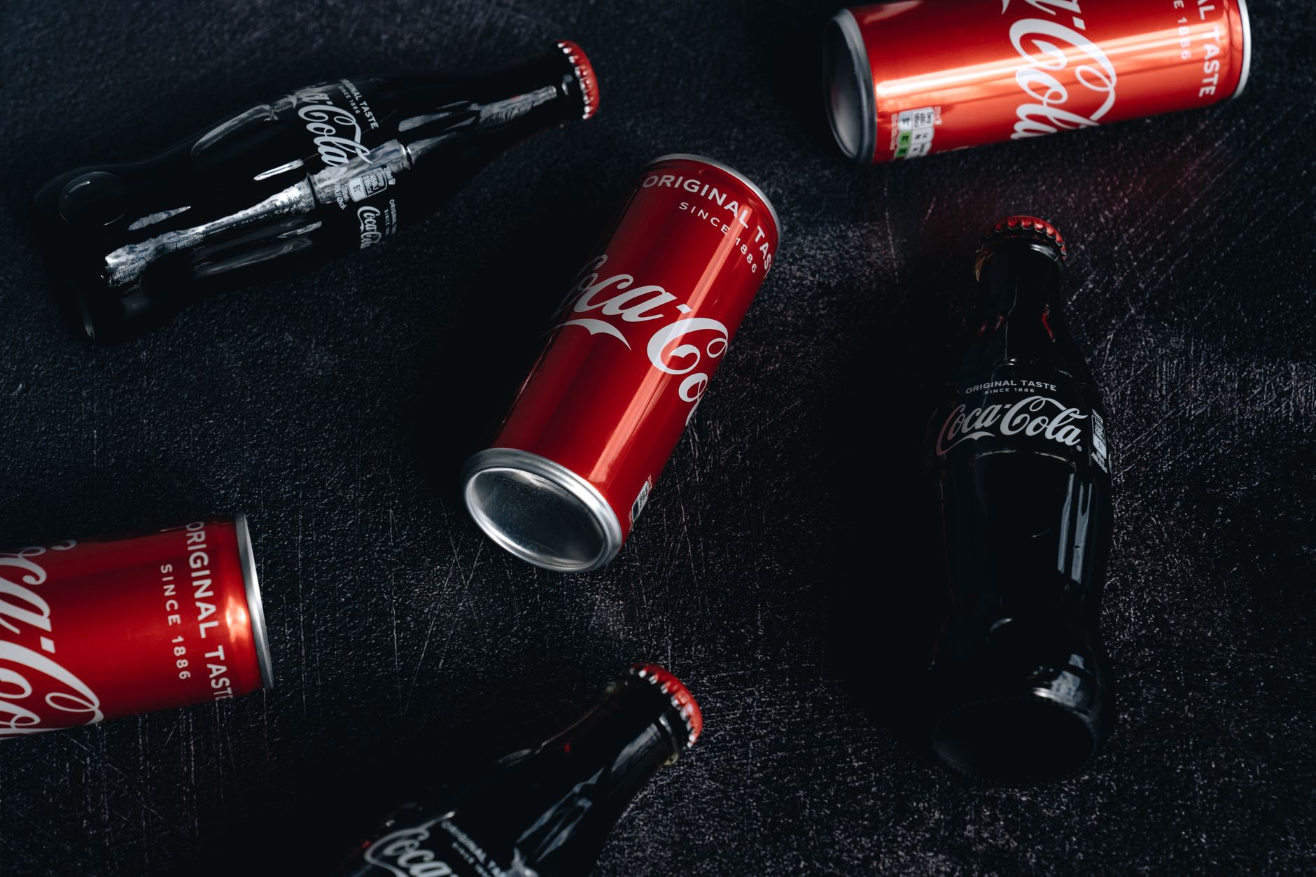
Lesson 3 – Storytelling Gives Your Brand Soul
Behind every Coca‑Cola bottle is a story of heritage, happiness, and shared moments. Google tells a story of innovation and accessibility. When you craft your brand narrative, tie it to something personal – maybe the local spice market that inspired your logo, or the community values that drive your service. Use that story in your “About Us” page, in social captions, and even in packaging copy. A compelling narrative turns a logo from a static image into an emotional experience for your customers.
Lesson 4 – Design for Flexibility
Google’s new guidelines emphasize modularity: the logo can appear in 2‑D, 3‑D, animated, or voice‑first formats without losing identity. Coca‑Cola’s retro cans show how a classic mark can be re‑imagined for limited editions while staying on brand. For Indian SMEs, think ahead. Create a logo that works in monochrome for newspaper ads, in full color for digital banners, and in simplified form for embroidery on uniforms. A flexible design saves you from costly redesigns when you expand to new channels. 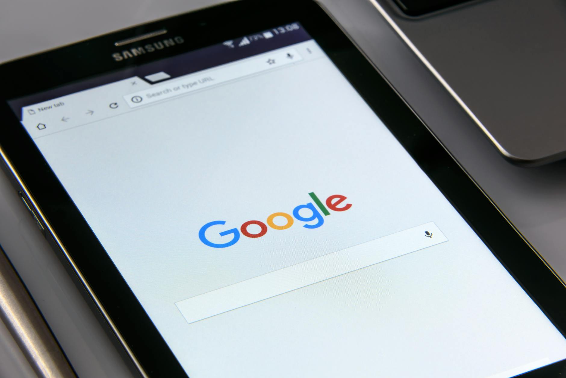
Lesson 5 – Emotional Connection Drives Loyalty
When people see the Coca‑Cola swirl, they recall celebrations; when they see Google, they think of answers at their fingertips. Emotional triggers are powerful sales tools. Use color psychology – India’s love for vibrant saffron, teal, or deep indigo – and incorporate culturally resonant symbols subtly. Pair your visual identity with consistent tone of voice – friendly, helpful, and locally aware – to deepen that connection.
How to Turn These Insights Into Action Today
- Audit your current assets. List every place your logo appears and note inconsistencies.
- Draft a one‑page brand guide. Include hex codes, font families, and clear logo spacing rules.
- Simplify your logo. If it has more than two colors or complex details, sketch a cleaner version.
- Write a 150‑word brand story. Highlight what makes your business uniquely Indian.
- Test flexibility. Mock up your logo on a mobile screen, a tote bag, and a billboard to ensure it scales.
Why Electron Graphics Is Your Partner in This Journey
At Electron Graphics, we specialize in translating global branding wisdom into affordable, locally relevant designs for Indian small businesses. Our team has helped over 300 startups across Delhi, Pune, and Kochi craft logos and brand systems that echo the consistency, simplicity, and storytelling power of Coca‑Cola and Google – without the multinational price tag. Ready to give your brand the same strategic edge? Contact us today and let’s turn your vision into a visual identity that customers remember.