Cracker Barrel to Instagram: What Big Brand Logo Overhauls Teach Indian Small Businesses

The Great Logo Debate: Why Everyone Is Talking About Rebranding
If you have spent any time scrolling through design forums or social media feeds recently, you have likely witnessed the intense internet debates sparked by modern brand refreshes. From heritage hospitality icons like Cracker Barrel updating their classic visual touchpoints to tech giants flattening their signatures for smartphone displays, corporate visual identity is under a microscope. Every time a beloved company tweaks its typography, simplifies its icon, or streamlines its color palette, consumers line up to voice their passionate critiques on platforms like X and Instagram.
Some critics call this shift modern evolution; others dismiss it as bland corporate minimalism—often dubbed 'blanding.' But beneath all the social media commentary lies an unavoidable truth: the way audiences interact with brands has fundamentally changed. Today, a logo rarely lives on a rustic wooden sign first. It lives inside a tiny circular avatar on Instagram, a mobile app icon, a WhatsApp Business header, or a quick digital ad frame.
So, what does this global tug-of-war between nostalgia and modern screen readiness mean for small business owners in India? Whether you run a growing boutique fashion label in Mumbai, an artisanal food venture in Bengaluru, or a fast-scaling B2B agency in Delhi, the lessons behind these high-profile rebrands can save you from costly design mistakes.
Why the Screen-First Revolution Matters to Indian Small Businesses
In India’s fast-moving business ecosystem, first impressions happen in a fraction of a second. The Indian consumer ecosystem is fiercely digital-first. Small business discovery predominantly occurs through mobile devices—whether a user is swiping through Instagram Reels, browsing a Shopify storefront, or reviewing a digital product catalog sent over WhatsApp.
Many legacy Indian businesses built their visual identity decades ago around detailed hand-drawn emblems, intricate gradients, or heavy drop shadows. While those designs carried undeniable warmth and character on physical storefronts, they frequently collapse when downscaled to a mobile phone screen. Intricate line work turns into a blurry smudge, script typography becomes unreadable, and overly complex color schemes clash against bright phone displays.
Conversely, many young small businesses panic and swing too far in the opposite direction. They pick an ultra-generic, sterile sans-serif font and neutral palette, completely stripping away the distinct warmth and local flavor that made their brand special in the first place.
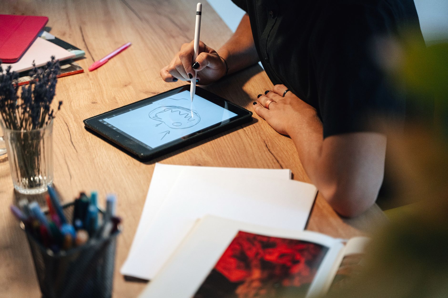
Striking the perfect balance between distinct personality and digital functionality is the real goal of modern visual branding. Here are five actionable takeaways every small business owner should keep in mind.
5 Key Branding Lessons for Small Business Owners
1. Prioritize Scalability Over Complex Storytelling
Your logo does not need to tell your entire company history in a single mark. Trying to fit your product list, heritage elements, and brand philosophy into one symbol usually leads to visual clutter. Instead, focus on visual clarity. A strong modern logo must look crisp on a massive highway hoarding and equally striking as a 32x32 pixel favicon on a web browser.
Ask yourself: If my logo is shrunk down to the size of a postage stamp on a smartphone screen, is it still instantly recognizable? If the answer is no, your current visual identity needs simplification.
2. Protect Your Brand's Soul (Avoid 'Blanding')
While minimalism improves readability, stripping away every drop of character creates a forgettable brand. The danger of trend-chasing is ending up with a visual presence that looks identical to ten other competitors in your niche. If you operate a traditional Indian brand or a boutique D2C company, embrace visual elements that give you a unique edge—whether that is a custom geometric shape, an expressive hand-crafted letterform, or a striking cultural color harmony.
The secret is modernizing your unique visual hooks rather than deleting them. Simplify the shapes, optimize the curves, and refine the proportions while keeping the emotional heart intact.
3. Build a Responsive Identity System, Not Just a Single Logo
Gone are the days when a business could survive with just one static horizontal logo file. Today, versatile brand design requires a dynamic logo system. This includes:
- Primary Logo: Your main logo used for websites, signage, and major brand touchpoints.
- Secondary/Stacked Logo: A vertical orientation ideal for square spaces, packaging, and store tags.
- Brand Mark or Monogram: A simplified icon or initial designed specifically for social media profile pictures, app icons, and watermarks.
- Favicon / Micro Icon: An ultra-minimal mark optimized for microscopic digital displays.
When you have a flexible system, you never have to force a wide horizontal logo into a tiny circular Instagram profile slot.
4. Test Your Design Across Real-World Touchpoints
Big corporations often face public backlash during rebrands because the visual identity was designed in an isolated studio bubble without testing real-world application. Before finalizing your business's visual identity, demand to see mockups across every realistic customer touchpoint.
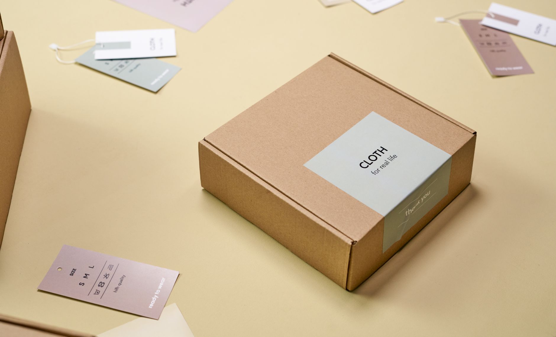
For an Indian small business, this means previewing your branding on custom butter paper, screen-printed carry bags, Instagram story graphics, website headers, invoice footers, and uniform badges. A design that looks stunning on a pristine white laptop screen might look washed out on craft paper packaging or hard to read against a dark mobile app dark mode.
5. Consistency Builds Trust Faster Than Perpetual Redesign
Major brands can afford to take massive visual risks because they already possess billions in equity and brand recall. As a small business, changing your look every six months confuses your existing customers and undermines your credibility. Once you establish a cohesive, modern visual system, stick with it consistently across all platforms.
Consistent presentation across your website, social media channels, packaging, and digital ads can boost overall brand recognition exponentially over time.
Build a Timeless Brand Identity with Electron Graphics
Navigating the fine line between digital modernity and unique brand character requires specialized design expertise. At Electron Graphics, we specialize in helping Indian small businesses, startups, and growing D2C brands stand out in crowded markets with world-class graphic design.
From crafting distinct, digital-ready logo systems and comprehensive brand strategy guides to designing high-converting web experiences and social media visual kits, our studio delivers strategic creative solutions tailored to your business goals. We ensure your brand looks effortless, professional, and captivating—whether viewed on a street banner or an Instagram feed.
Ready to elevate your business visual identity with a modern redesign? Partner with Electron Graphics today and let us build a visual brand system your customers will love.